Image Descriptions
2014 Fall Report of the Commissioner of the Environment and Sustainable Development
Image Descriptions
Exhibit 1.1—Climate change is affecting all regions of Canada
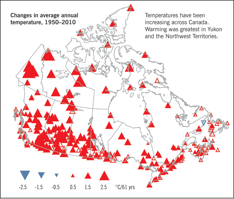
Source: Government of Canada, Canada in a Changing Climate: Sector Perspectives on Impacts and Adaptation, 2014.
The first map shows changes in average annual temperature from 1950 to 2010. The range of temperature change shown in the legend is from minus 2.5 degrees Celsius to plus 2.5 degrees Celsius over the 61 years from 1950 to 2010. The map shows that temperatures have been increasing across Canada during this period. But, warming was greatest in Yukon and the Northwest Territories.
The second map shows changes in annual total precipitation from 1950 to 2010. The range of precipitation change shown in the legend is from minus 300 millimetres to plus 300 millimetres over the 61 years from 1950 to 2010. The map shows that the coasts have become rainier and the Prairies have become drier during this period.
(Return)
Exhibit 1.2—The federal government has made domestic and international commitments to address climate change and reduce greenhouse gas emissions
The following timeline lists some of the federal government’s international and domestic commitments on climate change. For more details, see the 2012 Spring Report of the Commissioner of the Environment and Sustainable Development, Chapter 2—Meeting Canada’s 2020 Climate Change Commitments.
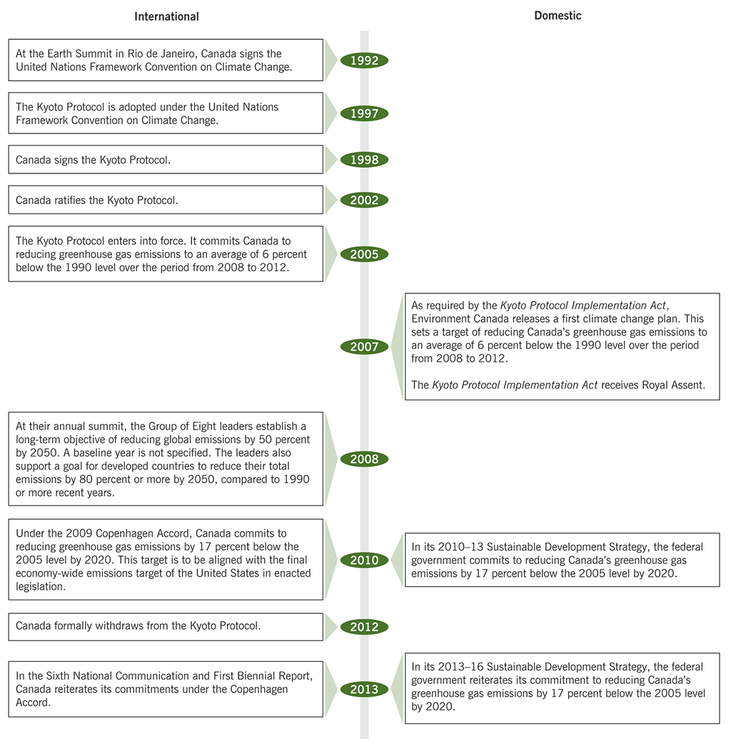
| Year | International | Domestic |
|---|---|---|
| 1992 | At the Earth Summit in Rio de Janeiro, Canada signs the United Nations Framework Convention on Climate Change. | |
| 1997 | The Kyoto Protocol is adopted under the United Nations Framework Convention on Climate Change. | |
| 1998 | Canada signs the Kyoto Protocol. | |
| 2002 | Canada ratifies the Kyoto Protocol. | |
| 2005 | The Kyoto Protocol enters into force. It commits Canada to reducing greenhouse gas emissions to an average of 6 percent below the 1990 level over the period from 2008 to 2012. | |
| 2007 | As required by the Kyoto Protocol Implementation Act, Environment Canada releases a first climate change plan. This sets a target of reducing Canada’s greenhouse gas emissions to an average of 6 percent below the 1990 level over the period from 2008 to 2012. The Kyoto Protocol Implementation Act receives Royal Assent. | |
| 2008 | At their annual summit, the Group of Eight leaders establish a long-term objective of reducing global emissions by 50 percent by 2050. A baseline year is not specified. The leaders also support a goal for developed countries to reduce their total emissions by 80 percent or more by 2050, compared to 1990 or more recent years. | |
| 2010 | Under the 2009 Copenhagen Accord, Canada commits to reducing greenhouse gas emissions by 17 percent below the 2005 level by 2020. This target is to be aligned with the final economy-wide emissions target of the United States in enacted legislation. | In its 2010–13 Sustainable Development Strategy, the federal government commits to reducing Canada’s greenhouse gas emissions by 17 percent below the 2005 level by 2020. |
| 2012 | Canada formally withdraws from the Kyoto Protocol. | |
| 2013 | In the Sixth National Communication and First Biennial Report, Canada reiterates its commitments under the Copenhagen Accord. | In its 2013–16 Sustainable Development Strategy, the federal government reiterates its commitment to reducing Canada’s greenhouse gas emissions by 17 percent below the 2005 level by 2020. |
(Return)
Exhibit 1.5—Current federal measures will have little effect on emissions by 2020
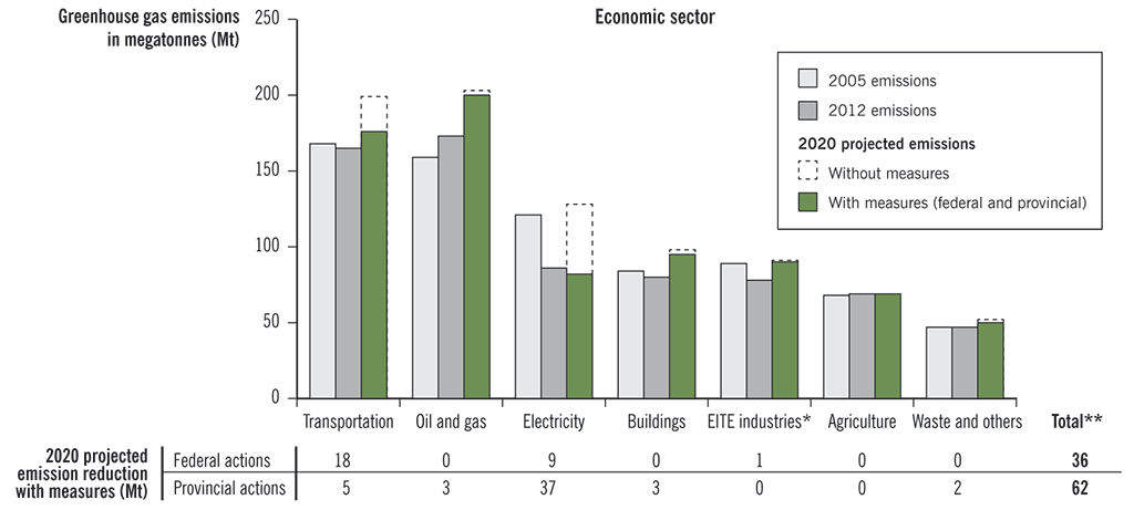
* EITE: emission-intensive trade-exposed industries
** Total emission reductions also include cross-cutting measures, which are estimated to be 8 Mt at the federal level, and 13 Mt at the provincial level. Cross-cutting measures are measures that affect more than one sector, such as the federal eco-efficiency programs or British Columbia’s carbon tax.
For each economic sector, the first bar in each group corresponds to the estimated greenhouse gas emissions for 2005, the baseline year for the Copenhagen Accord target. The second bar in each group corresponds to the most recent (2012) estimates of current emissions. The third bar in each group corresponds to the emissions projected by Environment Canada for 2020. The top of the third bar (“Without measures”) represents the projected emissions if none of the current or announced federal or provincial measures are taken into account. The solid portion of the bar corresponds to the projected emissions if all of the current and announced measures are included (“With measures”).
Sources: Canada’s National Inventory Report and Sixth National Communication on Climate Change and First Biennial Report to the United Nations Framework Convention on Climate Change
This chart shows the 2005 and 2012 greenhouse gas emissions for seven different economic sectors, as well as projected 2020 emissions with and without federal and provincial measures. A table below the chart lists the 2020 projected emission reductions in megatonnes with reduction measures from either federal actions or provincial actions.
The following table lists the estimated and projected emissions for the seven economic sectors.
| Greenhouse gas emissions in megatonnes | ||||
|---|---|---|---|---|
| Economic sector | 2005 emissions | 2012 emissions | 2020 projected emissions with reduction measures (federal and provincial) | 2020 projected emissions without reduction measures |
| Transportation | 168 | 165 | 176 | 199 |
| Oil and Gas | 159 | 173 | 200 | 203 |
| Electricity | 121 | 86 | 82 | 128 |
| Buildings | 84 | 80 | 95 | 98 |
| EITE Industries | 89 | 78 | 90 | 91 |
| Agriculture | 68 | 69 | 69 | 69 |
| Waste and Others | 47 | 47 | 50 | 52 |
For each economic sector, the first number corresponds to the estimated greenhouse gas emissions for 2005, the baseline year for the Copenhagen Accord target. The second number corresponds to the most recent (2012) estimates of current emissions. The third number corresponds to the emissions projected by Environment Canada for 2020 if all of the current and announced measures are included (“With measures”). The fourth number (“Without measures”) represents the projected emissions if none of the current or announced federal or provincial measures are taken into account.
The following table lists the 2020 projected emission reductions with reduction measures from either federal actions or provincial actions.
| Emission reductions by 2020 due to federal actions (in megatonnes) | Emission reductions by 2020 due to provincial actions (in megatonnes) | |
|---|---|---|
| 18 | 5 | |
| 0 | 3 | |
| 9 | 37 | |
| 0 | 3 | |
| 1 | 0 | |
| 0 | 0 | |
| 0 | 2 | |
| Total | 36 | 62 |
(Return)
Exhibit 1.8—Environment Canada's emission reports could include additional information relevant to decision makers
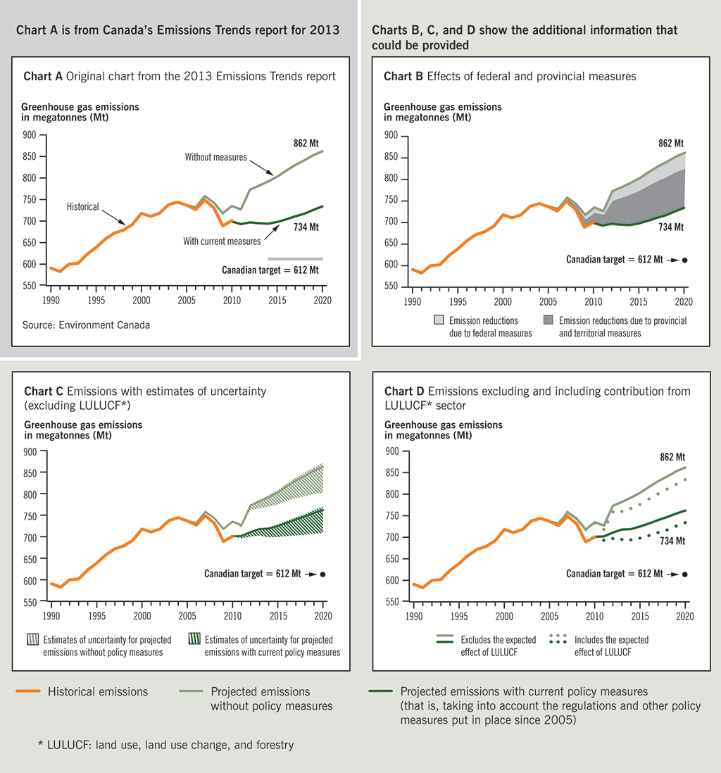
This exhibit contains four charts. The charts are labeled A, B, C, and D. Chart A presents an original chart from the 2013 Emissions Trends report. Charts B, C, and D include hypothetical information to show what additional information could have been provided.
Chart A, the original chart, shows historical greenhouse gas emissions in megatonnes from 1990 to 2010 and then two projections of emissions up to 2020. The first projection includes the effects of current reduction measures. The second projection does not include the effects of the reduction measures that were put in place after 2005. According to the projections, emissions in 2020 will increase to 734 megatonnes with current measures and 862 megatonnes without these measures. In 2020, the total emission reduction is projected to be 128 megatonnes, which is the difference between the projection with current measures (734 megatonnes) and the projection without measures (862 megatonnes). The Canadian target for 2020 is 612 megatonnes. The source of this information is Environment Canada.
The following table lists the data for Chart A.
| Greenhouse gas emissions in megatonnes | ||||
|---|---|---|---|---|
| Year | Historical | With current measures | Without measures | Canadian target for 2020 |
| 1990 | 591 | |||
| 1991 | 583 | |||
| 1992 | 600 | |||
| 1993 | 602 | |||
| 1994 | 623 | |||
| 1995 | 639 | |||
| 1996 | 658 | |||
| 1997 | 672 | |||
| 1998 | 679 | |||
| 1999 | 692 | |||
| 2000 | 718 | |||
| 2001 | 711 | |||
| 2002 | 718 | |||
| 2003 | 738 | |||
| 2004 | 744 | |||
| 2005 | 737 | 737 | ||
| 2006 | 727 | 732 | ||
| 2007 | 749 | 758 | ||
| 2008 | 731 | 743 | ||
| 2009 | 689 | 718 | ||
| 2010 | 701 | 699 | 735 | |
| 2011 | 693 | 727 | ||
| 2012 | 697 | 773 | ||
| 2013 | 695 | 782 | ||
| 2014 | 694 | 792 | ||
| 2015 | 698 | 803 | ||
| 2016 | 704 | 817 | ||
| 2017 | 711 | 830 | ||
| 2018 | 717 | 841 | ||
| 2019 | 726 | 853 | ||
| 2020 | 734 | 862 | 612 | |
Charts B, C, and D include hypothetical information to show the additional information that could be provided.
Chart B shows the additional information that could be provided if the effects of reduction measures were separated into federal and provincial measures. This chart shows the same numbers as Chart A from 1990 to 2010, the same projected emissions of 734 megatonnes in 2020 with current measures and 862 megatonnes without measures, and the same Canadian target for 2020 of 612 megatonnes.
Chart B also shows that in the projections of emissions up to 2020, federal reduction measures account for a hypothetical one third of the total emission reduction, and provincial and territorial reduction measures account for a hypothetical two thirds of the total emission reduction. In Chart A, the effects of reduction measures are not separated into federal and provincial measures.
Chart C shows the projected emissions with estimates of uncertainty, excluding estimates for the land use, land use change, and forestry (LULUCF) sector. This chart shows the same numbers as Chart A from 1990 to 2010, the same projected emissions of 862 megatonnes in 2020 without measures, and the same Canadian target for 2020 of 612 megatonnes. The projection with measures is different from the one in Chart A because the projection in this chart excludes the LULUCF contribution. This projection shows an increasing trend ending at 762 megatonnes in 2020.
Chart C also shows that, in the two projections from 2010 to 2020, estimates of the uncertainty around the projections could be provided to decision makers by showing a range around the projections. In the chart, the hypothetical estimates of uncertainty around the projection with measures increase from zero in 2010 to a range of 60 megatonnes in 2020. The hypothetical estimates of uncertainty around the projection without measures increase from zero in 2010 to a range of 70 megatonnes in 2020.
Chart D shows the emissions excluding and including the contribution from the land use, land use change, and forestry (LULUCF) sector. This chart shows the same numbers as Chart A from 1990 to 2010, which include
- the same two projections from 2010 to 2020—one shows projected emissions of 734 megatonnes in 2020 with current emission reduction measures; the other shows projected emissions of 862 megatonnes without reduction measures; and
- the same Canadian target for 2020 of 612 megatonnes.
Chart D also shows additional information that could be provided in the projections from 2010 to 2020 by estimating the effect of the contribution from the LULUCF sector. This chart provides four separate projections:
- A projection with emission reduction measures that excludes the contribution of the LULUCF sector. This projection shows increases in emissions and ends in 2020 at 762 megatonnes.
- A projection with emission reduction measures that includes the contribution of the LULUCF sector. This projection shows increases in emissions and ends in 2020 at 734 megatonnes. This projection is lower than the one that excludes the effect of LULUCF and is the projection provided in Chart A.
- A projection without emission reduction measures that includes the contribution of the LULUCF sector. This projection shows increases in emissions and ends in 2020 at 834 megatonnes.
- A projection without emission reduction measures that excludes the contribution of the LULUCF sector. This projection shows increases in emissions and ends in 2020 at 862 megatonnes. This projection is higher than the one that includes the effect of LULUCF and is the projection provided in Chart A.
The estimates for the contribution of the LULUCF sector come from Environment Canada.
The following table lists the data for Chart D.
| Greenhouse gas emissions in megatonnes | ||||||
|---|---|---|---|---|---|---|
| Year | Historical | With measures | Without measures | Canadian target for 2020 | ||
| including LULUCF | excluding LULUCF | including LULUCF | excluding LULUCF | |||
| 1990 | 591 | |||||
| 1991 | 583 | |||||
| 1992 | 600 | |||||
| 1993 | 602 | |||||
| 1994 | 623 | |||||
| 1995 | 639 | |||||
| 1996 | 658 | |||||
| 1997 | 672 | |||||
| 1998 | 679 | |||||
| 1999 | 692 | |||||
| 2000 | 718 | |||||
| 2001 | 711 | |||||
| 2002 | 718 | |||||
| 2003 | 738 | |||||
| 2004 | 744 | |||||
| 2005 | 737 | 737 | 737 | |||
| 2006 | 727 | 732 | 732 | |||
| 2007 | 749 | 758 | 758 | |||
| 2008 | 731 | 743 | 743 | |||
| 2009 | 689 | 718 | 718 | |||
| 2010 | 701 | 699 | 701 | 733 | 735 | |
| 2011 | 693 | 702 | 718 | 727 | ||
| 2012 | 697 | 711 | 759 | 773 | ||
| 2013 | 695 | 718 | 760 | 782 | ||
| 2014 | 694 | 719 | 767 | 792 | ||
| 2015 | 698 | 725 | 776 | 803 | ||
| 2016 | 704 | 732 | 789 | 817 | ||
| 2017 | 711 | 740 | 801 | 830 | ||
| 2018 | 717 | 747 | 812 | 841 | ||
| 2019 | 726 | 755 | 823 | 853 | ||
| 2020 | 734 | 762 | 834 | 862 | 612 | |
(Return)
Exhibit 2.1—Canada’s oil sands
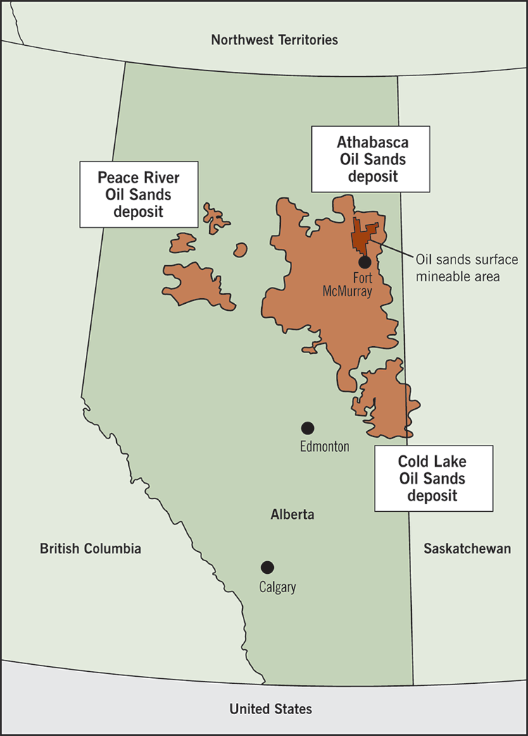
Source: Adapted by the OAG from various publicly available maps.
This map of Alberta shows the location of Canada’s oil sands, which include the Peace River Oil Sands deposit, the Athabasca Oil Sands deposit, and the Cold Lake Oil Sands deposit.
The map also shows the location of the oil sands surface mineable area, located in the northeastern section of the Athabasca Oil Sands deposit.
(Return)
Exhibit 2.2—Growth in oil sands production
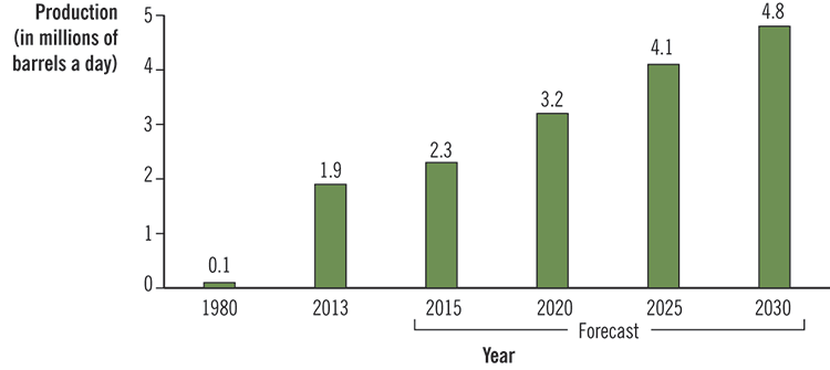
Source: Data from the Canadian Association of Petroleum Producers
In 1980, 0.1 millions of barrels a day of oil were produced. That number increased in 2013 to 1.9. The projected figures for 2015 to 2030 are as follows:
2015: 2.3 millions of barrels a day
2020: 3.2 millions of barrels a day
2025: 4.1 millions of barrels a day
2030: 4.8 millions of barrels a day
(Return)
Exhibit 3.1—Arctic waters included in the scope of the audit
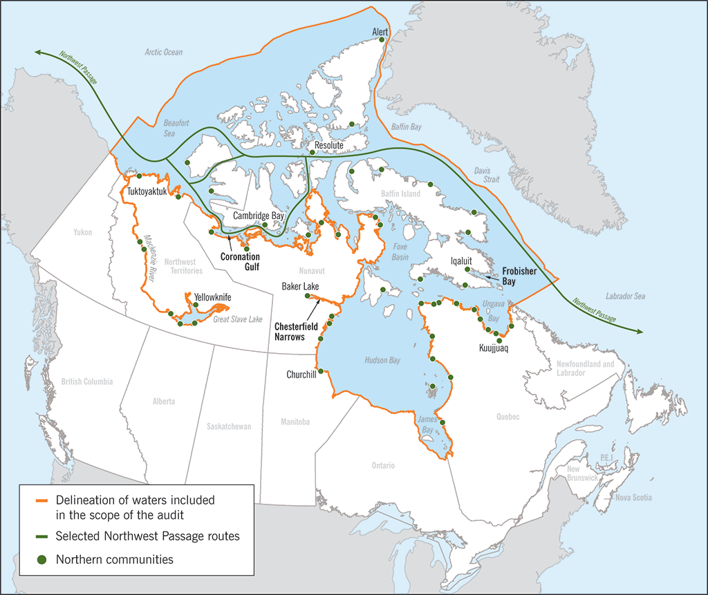
Note: Not all northern communities are represented on the map.
This map delineates which bodies of water in the Arctic are included in the scope of the audit. It also depicts selected Northwest Passage routes for marine transportation of goods through Canada’s Arctic, as well as where the Northern communities are situated.
(Return)
Exhibit 3.2—Vessel voyages in the Canadian Arctic since 1990
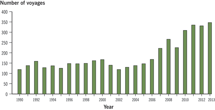
Source: Coast Guard estimates up to 31 December 2013
This bar chart shows how the number of vessel voyages in the Canadian Arctic has increased in the last 20 years.
| Year | Number of voyages |
|---|---|
| 1990 | 119 |
| 1992 | 159 |
| 1996 | 148 |
| 1998 | 149 |
| 2000 | 167 |
| 2002 | 119 |
| 2004 | 138 |
| 2006 | 168 |
| 2008 | 266 |
| 2010 | 309 |
| 2012 | 331 |
| 2013 | 347 |
(Return)
Exhibit 3.3—Hydrographic survey methods have improved over time
The quality and accuracy of nautical charts depend on the data used to produce them. Modern charts are compiled from hydrographic surveys conducted on vessels equipped with sonar technology that measures water depths, while satellite navigation systems, such as the global positioning systems, determine the precise geographic positions of the vessels’ soundings. Data collected through post-1970s technology, including single-beam sonar technology, is referred to as “surveyed to adequate standards.” Data collected through multi-beam sonar technology that became commercially available in the 1990s is referred to as “surveyed to modern standards.”
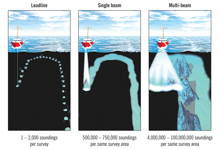
Source: Adapted from the Canadian Hydrographic Service
The image depicting the leadline method shows how it only captures 1 - 2,000 soundings per survey.
The image depicting the single beam method shows how it captures 500,000 - 750,000 soundings per same survey area.
The image depicting the multi-beam method shows how it captures 4,000,000 - 100, 000,000 soundings per same survey area.
(Return)
Exhibit 3.4—Many Arctic shipping routes have inadequate surveys and charts
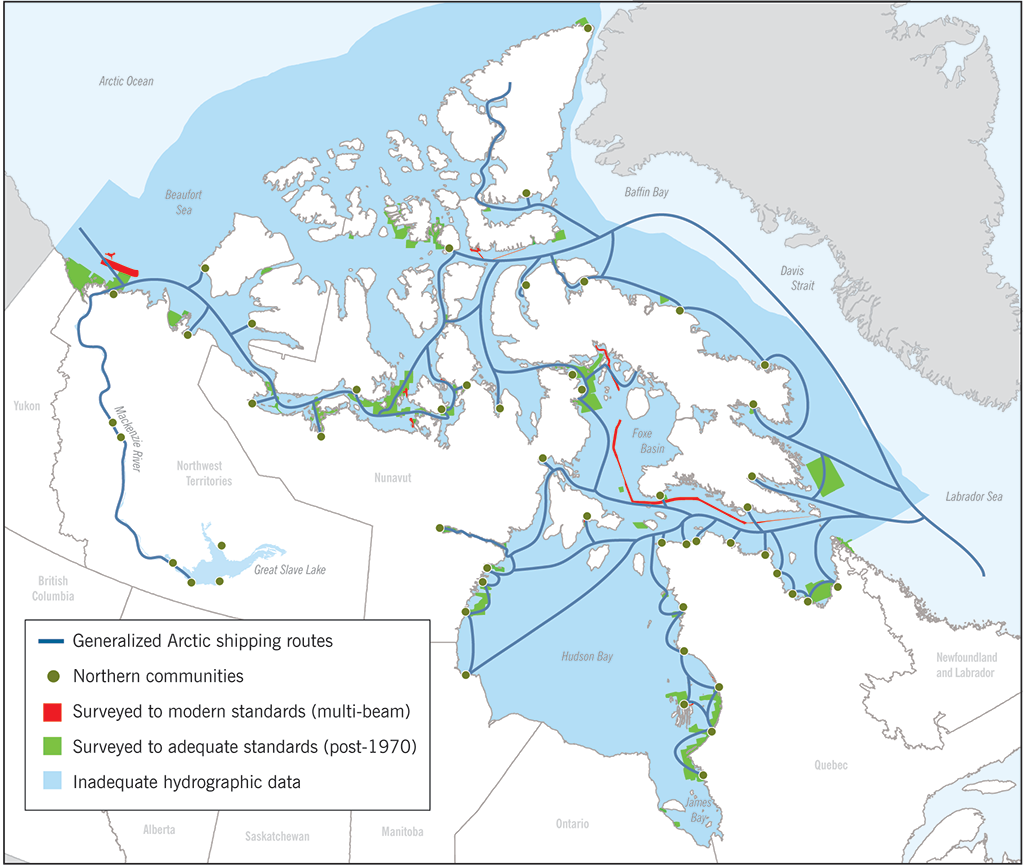
Note: Not all northern communities are represented on the map.
Source: Adapted from Fisheries and Oceans Canada
The map depicts the generalized Arctic shipping routes as well as the routes that have inadequate hydrographic data. The map also shows the routes that were surveyed to modern standards through multi-beam sonar technology and those that were surveyed to adequate standards (post-1970).
(Return)
Exhibit 3.7—The National Aerial Surveillance Program’s Dash 7 plane is equipped for multipurpose missions

The photo shows the National Aerial Surveillance Program’s Dash 7 plane. It shows the observation domes for mapping and photography, which are located on the top and side of the plane. The photo also shows the side-looking airborne radar, which is located on the bottom of the plane as well as the MX-15 Electro-optical Infrared Camera System, also located on the bottom of the plane.
(Return)
Exhibit 4.1—Environmental assessments that began under CEAA 2012 on or after 6 July 2012
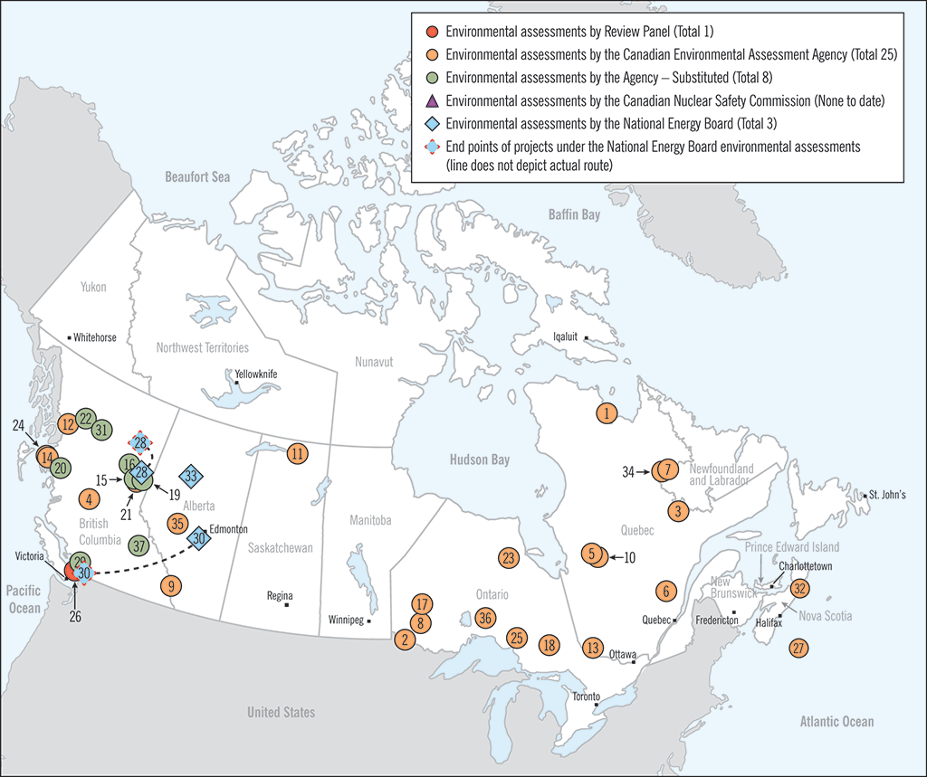
Source: Canadian Environmental Assessment Agency
This map shows the location of all the environmental assessments commenced under CEAA 2012 on or after 6 July 2012.
The following types of environmental assessments can be located on the map:
- 1 environmental assessment by the Review Panel
- 25 environmental assessments by the Canadian Environmental Assessment Agency
- 8 environmental assessments by the Canadian Environmental Assessment Agency – Substituted
- 3 environmental assessments by the National Energy Board
The map also shows that there were no environmental assessments conducted by the Canadian Nuclear Safety Commission. It also indicates end points of projects under the National Energy Board environmental assessments.
This map does not include
- projects that were determined by Agency screening to not require an environmental assessment;
- environmental assessments that were terminated;
- environmental assessments that began under the former CEAA and continued under CEAA 2012 (for example, panel projects such as the Enbridge Northern Gateway Project); and
- projects under consideration for environmental assessment at the time of writing.
(Return)
Exhibit 4.2—The Agency has two types of processes for environmental assessments, both of which include opportunities for public participation
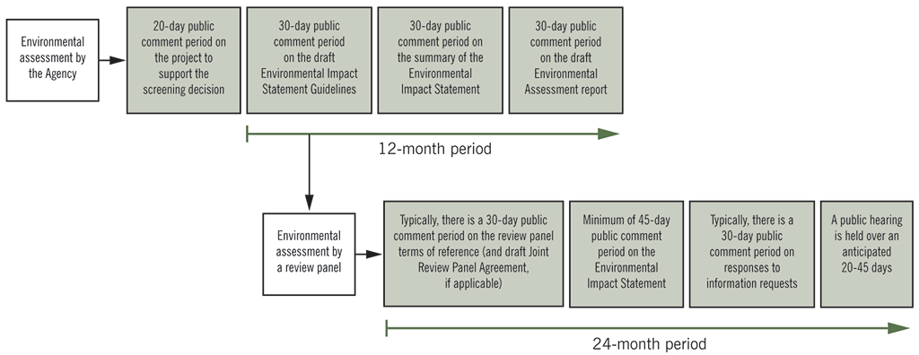
Note: The terms of reference set out the scope and limitations of a review panel’s activities and the environmental assessment.
There are two types of processes for environmental assessments.
The environmental assessment by the Canadian Environmental Assessment Agency is done over a 12-month period and involves the following steps:
- a 20-day public comment period on the project to support screening decision,
- a 30-day public comment period on draft Environmental Impact Statement Guidelines,
- a 30-day public comment period on the summary of the Environmental Impact Statement, and
- a 30-day public comment period on draft Environmental Assessment report.
The environmental assessment by a review panel is done over a period of 24 months and involves the following steps:
- a 30-day public comment period on review panel terms of reference (and draft Joint Review Panel Agreement, if applicable),
- a minimum 45-day public comment period on Environmental Impact Statement,
- a 30-day public comment period on responses to information requests, and
- a public hearing held over an anticipated 20-45 days.
(Return)
Exhibit 4.3—The National Energy Board decides who participates in an environmental assessment process and in what manner
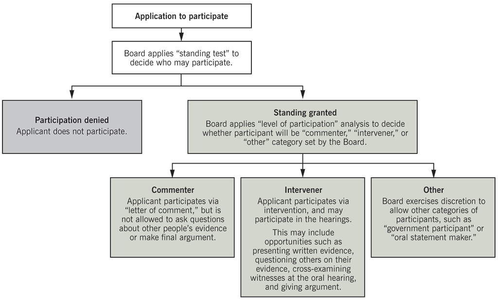
Source: Adapted from National Energy Board guidance.
This flow chart shows the breakdown of who participates in an environmental assessment process and in what manner.
The process begins with an application to participate. The National Energy Board then applies a “standing test” to decide who may participate. If participation is denied, the applicant does not participate. If the standing is granted, the Board applies a “level of participation” analysis to decide whether the participant will be a “commenter”, an “intervener”, or part of another category set by the Board.
As a commenter, the applicant participates via “letter of comment”, but is not allowed to ask questions about other people’s evidence or make a final argument.
As an intervener, the applicant participates via intervention, and may participate in the hearings. This may include opportunities such as presenting written evidence, questioning others on their evidence, cross-examining witnesses at the oral hearing, and giving arguments.
If the individual participates as part of another category, the Board exercises discretion to allow other categories of participants, such as “government participants”, or “oral statement makers.”
(Return)
Exhibit 6.1—Petitions came from five provinces (1 July 2013 to 30 June 2014)
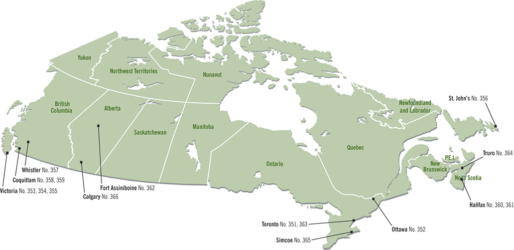
This map of Canada shows the communities from which the petitions came during the period from 1 July 2013 to 30 June 2014. Petitions came from five provinces: British Columbia, Alberta, Ontario, Nova Scotia, and Newfoundland and Labrador.
British Columbia
- Victoria: Petitions 353, 354, 355
- Whistler: Petition 357
- Coquitlam: Petitions 358, 359
Alberta
- Fort Assiniboine: Petition 362
- Calgary: Petition 366
Ontario
- Toronto: Petitions 351, 363
- Ottawa: Petition 352
- Simcoe: Petition 365
Nova Scotia
- Halifax: Petitions 360, 361
- Truro: Petition 364
Newfoundland and Labrador
- St. John’s: Petition 356
(Return)
Exhibit 6.2—Federal departments and agencies that received petitions this year (1 July 2013 to 30 June 2014)
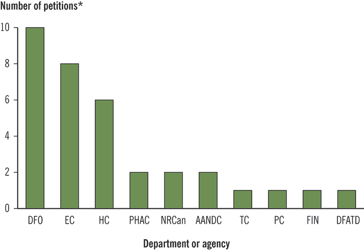
This chart shows the number of petitions for each department and agency.
| Department or agency | Number of petitions |
|---|---|
| DFO: Fisheries and Oceans Canada | 10 |
| EC: Environment Canada | 8 |
| HC: Health Canada | 6 |
| PHAC: Public Health Agency of Canada | 2 |
| NRCan: Natural Resources Canada | 2 |
| AANDC: Aboriginal Affairs and Northern Development Canada | 2 |
| TC: Transport Canada | 1 |
| PC: Parks Canada | 1 |
| FIN: Department of Finance Canada | 1 |
| DFATD: Foreign Affairs, Trade and Development Canada | 1 |
Note that the same petition may be sent to more than one department or agency.
(Return)
Exhibit 6.8—The Pacific North Coast Integrated Management Area in British Columbia
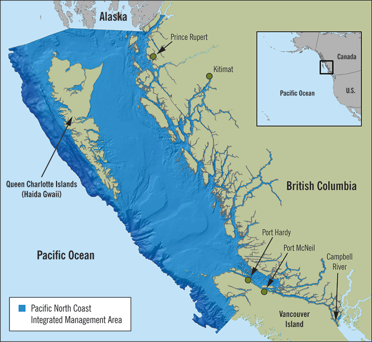
Source: Living Oceans Society
This map shows an area of the Pacific Ocean that represents the north coast integrated management area. This area is located on the west coast of central and northern British Columbia. An inset map shows the length of North American west coast to better define the location of the area in the Pacific Ocean on Canada’s west coast. The area encompasses the waters from the Canada-Alaska border, surrounds the Queen Charlotte Islands (Haida Gwaii,) and extends to the northern part of Vancouver Island on the west side and the Campbell River on the east side. Some inland communities near the management area are shown: from north to south, they are Prince Rupert, Kitimat, Port Hardy, and Port McNeil.
(Return)